Style & Context
Influences
70s Farrah Fawcett glamour shots, early Britney Spears promotional images, vintage Revlon campaigns
Location
The cover positions Carpenter within the new guard of pop women reclaiming desire on their terms, not male producers'.
Visual Language
The high-contrast lighting and clean composition recall an era when pop stars sold fantasy through controlled perfection.
Symbols
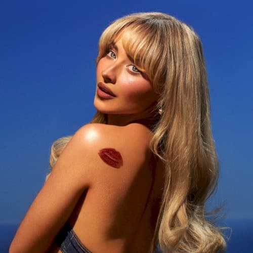
Lipstick kiss mark on shoulder
The kiss stamp signals ownership of her sexuality while keeping the tone playful rather than serious.
Over-the-shoulder glance
The backward look invites the viewer into complicity, suggesting secrets shared between artist and audience.
Bare shoulders and visible back
The exposed skin balances vulnerability with power, reflecting the album's lyrical honesty about desire.
Where Sound Meets Image
The cover's playful sensuality mirrors the album's lyrical approach to relationships and desire. Songs like 'Espresso' and 'Please Please Please' blend cheeky wordplay with genuine emotion, matching the kiss mark's balance of flirtation and authenticity. The blue background's artificial perfection reflects the dance-pop production's polished sheen, while the backward glance suggests the introspection present in acoustic moments. The overall aesthetic promises exactly what the album delivers: pop music that's sweet but never saccharine, short but never shallow.
The cover reinforces a mini-renaissance of straightforward glamour shots in an era dominated by conceptual album art. By stripping away elaborate styling or surreal imagery, Carpenter lets personality carry the visual, trusting her expression and a single prop to communicate the album's essence. The design influenced a wave of promotional images favoring simplicity over complexity, proving that in oversaturated visual culture, sometimes a wink and a kiss mark say more than elaborate concepts.