Style & Context
Influences
Seventeen magazine covers, teen catalog modeling, late-90s mall culture aesthetics
Location
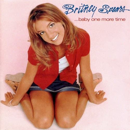
This cover arrived when teen pop was reclaiming charts from grunge and alternative rock's dominance throughout mid-90s radio.
Visual Language
The lighting flatters without glamorizing, maintaining relatability while achieving professional polish that separates stars from amateurs.
Symbols
Kneeling pose
The posture suggests playful vulnerability, a non-threatening femininity carefully calibrated for maximum crossover appeal.
Schoolgirl outfit
The uniform aesthetic traffics in adolescent fantasy while maintaining plausible deniability through its mall-store accessibility.
Direct eye contact
Britney's unflinching gaze invites intimacy with the viewer, promising both friendship and aspiration simultaneously.
Where Sound Meets Image
The visual restraint mirrors the album's production strategy — glossy, professional pop that never threatens to get too complex or challenging. Britney's casual pose matches the conversational delivery of hits like the title track and 'Sometimes,' where she plays the relatable teenager navigating crushes and heartbreak. The schoolgirl aesthetic directly reinforces the '...Baby One More Time' video's iconic classroom setting, creating unified branding. The soft-focus femininity aligns with the album's sweetness, even when lyrics hint at deeper longing. Everything about this image promises accessible, non-confrontational pop designed for maximum radio rotation.
This cover established the visual language for an entire wave of teen pop stars — from Jessica Simpson to early Mandy Moore, everyone borrowed this formula of soft backgrounds, direct gazes, and carefully casual styling. The schoolgirl aesthetic became so synonymous with Britney that it spawned countless Halloween costumes and parodies. The image's calculated innocence became a cultural flashpoint for debates about the sexualization of teen stars that continue today. When current pop stars reference late-90s nostalgia, they're often channeling this exact visual vernacular.