Style & Context
Influences
M.C. Escher, 1970s architectural photography, Japanese minimalism, Magritte's domestic surrealism
Location
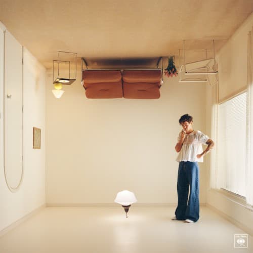
The sparse room could exist in any city, reflecting Styles' transatlantic life between London and Los Angeles.
Visual Language
The impossible geometry recalls Escher while the warm vintage palette evokes city pop aesthetics.
Symbols
Upside-down perspective
The inverted room represents how fame turns personal life inside-out and backwards.
Empty white room
Blank domestic space suggests both creative possibility and the loneliness of isolation.
Mushroom lamp
The solitary light source symbolizes finding warmth and grounding in minimal comforts.
Where Sound Meets Image
The disorienting perspective mirrors the album's lyrical exploration of relationships from unconventional angles, examining domesticity through the lens of a global pop star. The warm, analog color grading matches the synth-pop and city pop production, which layers vintage textures over contemporary songwriting. The emptiness of the space reflects songs like 'As It Was' that grapple with change and solitude, while the impossible architecture suggests the new wave experimentation throughout the tracklist.
The cover helped popularize a return to simple, surreal photography in pop packaging after years of heavily stylized digital composites. Its spatial trick became widely imitated on social media, spawning countless recreations. The minimalist approach influenced subsequent pop releases to embrace emptiness and negative space rather than cluttered maximalism, while the vintage warmth contributed to the ongoing analog aesthetic revival in music visuals.