Style & Context
Influences
Robert Frank, '60s photojournalism, Laurel Canyon casual aesthetic
Location
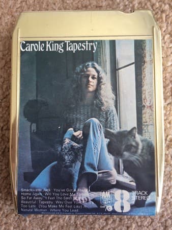
The image captures the Laurel Canyon ethos where rock royalty lived in rustic simplicity.
Visual Language
The unposed naturalism borrows from documentary photography while creating an intimate portrait style.
Symbols
Window seat positioning
King occupies a threshold space between interior reflection and the outside world's possibilities.
The cat companion
The feline presence emphasizes solitude without loneliness, suggesting creative self-sufficiency and comfort.
Bare feet and casual denim
These details reject the polished performance aesthetic, signaling authenticity as the new currency.
Where Sound Meets Image
The cover's domestic simplicity mirrors Tapestry's piano-driven intimacy, where King transformed Brill Building professionalism into personal revelation. Just as she sits comfortably in her own space, songs like 'So Far Away' and 'Home Again' center on private emotional geography rather than grand romance narratives. The unguarded quality of the photograph matches the album's vulnerable confessions about friendship, heartbreak, and self-discovery. The window behind her suggests the same openness found in lyrics that invite listeners into her emotional world without pretense.
This cover established that female artists could sell millions without glamour shots or come-hither poses, influencing everyone from Joni Mitchell to Alanis Morissette. The straightforward portrait style became shorthand for authenticity in singer-songwriter marketing, spawned countless imitations of artists photographed in casual home settings. Its success proved audiences wanted connection over fantasy, reshaping how record labels photographed artists across genres for decades.