Style & Context
Influences
Terry Richardson portraiture, Hedi Slimane rock photography, punk zine collage aesthetics
Location
This visual language spoke directly to millennials raised on Tumblr aesthetics and Instagram filters valuing rawness.
Visual Language
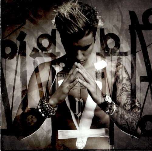
The layered exposures create visual noise that mirrors the chaotic media storm surrounding Bieber's reinvention.
Symbols
Praying hands gesture
The central prayer pose announces Bieber's spiritual rebirth and plea for forgiveness from fans.
Cross symbol layered below
The inverted cross overlay suggests both religious devotion and punk rebellion against his past image.
Fragmented typography
Broken letters spell his name incompletely, visualizing an identity shattered and being pieced back together.
Where Sound Meets Image
The fractured visuals mirror Purpose's sonic patchwork of tropical house beats, EDM drops, and R&B slow jams that refuse to settle into one genre. Prayer hands connect directly to tracks exploring faith and forgiveness while the monochrome treatment matches the album's serious tone despite danceable production. The overlapping images visualize the album's central tension between club-ready anthems like Sorry and introspective ballads like Life Is Worth Living, showing an artist trying to be everything to everyone while finding himself.
This cover established the template for pop comeback narratives through visual fragmentation and religious symbolism that later appeared in Demi Lovato and Selena Gomez reinventions. The desaturated aesthetic influenced a wave of pop stars abandoning colorful branding for monochrome maturity. Its success proved that former teen idols could rebrand through strategic vulnerability, making broken typography and prayer imagery standard tools for redemption arcs across pop culture.