Style & Context
Influences
Jean-Michel Basquiat, Cy Twombly, punk zine aesthetics, abstract expressionism
Location
The unfinished quality spoke to millennial exhaustion with curated authenticity and Instagram facades.
Visual Language
The deliberately crude application rejects commercial polish in favor of raw emotional honesty.
Symbols
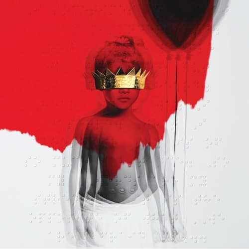
Paper crown covering eyes
Fame blinds authentic identity while conferring hollow royalty that obscures clear vision.
Red paint obscuring body
Public persona violently erases private self, staining childhood innocence with industry trauma.
Braille text at bottom
True meaning exists beneath surface visibility, accessible only through alternative modes of perception.
Where Sound Meets Image
The cover's violent abstraction perfectly matched ANTI's refusal to deliver expected bangers, instead offering atmospheric experimentation across doo-wop, trap, and psychedelic soul. Just as red paint obscures the figure's body, songs like 'Higher' and 'James Joint' blur genre boundaries into hazy ambiguity. The childhood imagery connects to the album's themes of lost innocence and exhausted fame explored in 'Consideration' and 'Close To You.' The cheap crown's irony mirrors lyrics questioning celebrity's worth throughout the tracklist.
This cover helped normalize anti-commercial aesthetics among major pop releases, influencing subsequent artists to embrace imperfection and visual restraint. The braille element expanded conversations about accessibility in album design. Fashion brands and editorial photography borrowed its technique of violent color interrupting grayscale portraiture, making the style ubiquitous in 2017-2019 visual culture.