Style & Context
Influences
Depression-era documentary photography, European art cinema, 1960s counterculture album aesthetics
Location
This anti-commercial aesthetic positioned Simon and Garfunkel as serious artists rather than teen pop stars.
Visual Language
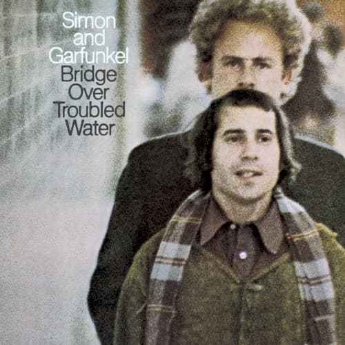
The intentionally degraded photographic quality rejects the glossy commercial sheen dominating 1970 pop releases.
Symbols
Blurred focus effect
The soft-focus photography suggests emotional distance between Paul Simon and Art Garfunkel during recording sessions.
Vertical alignment of faces
Art positioned above Paul creates a visual hierarchy mirroring their vocal arrangements and creative tensions.
Weathered stone texture
The ancient-looking background evokes the enduring spiritual themes explored in the title track's gospel influences.
Where Sound Meets Image
The cover's ghostly blurriness mirrors the album's production choices, where lush orchestration and gospel choirs often obscure the core duo dynamic. Just as the photograph makes Simon and Garfunkel appear distant and dreamlike, tracks like the title song feature Garfunkel's voice soaring alone while Simon fades into the background. The weathered stone texture connects to the album's spiritual searching and hymn-like arrangements, particularly on the gospel-influenced title track.
This anti-design approach influenced countless singer-songwriter albums throughout the 1970s, establishing that serious folk-pop required understated, almost amateur-looking visuals. The degraded photograph aesthetic became shorthand for authenticity and emotional depth, copied by James Taylor, Carole King, and the entire Laurel Canyon scene who similarly rejected commercial gloss for intimate, lived-in imagery.