Style & Context
Influences
Richard Avedon, Irving Penn, 1950s glamour portraiture, classic soul album aesthetics
Location
The cover rejected the era's trend toward elaborate concepts and styling, choosing stripped-down authenticity instead.
Visual Language
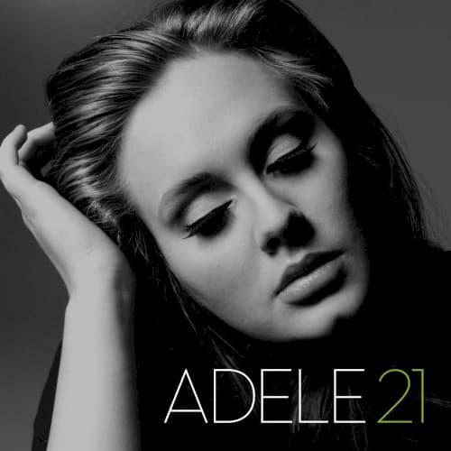
The dramatic side lighting creates sculptural depth while maintaining soft focus that keeps the mood intimate rather than harsh.
Symbols
Downward gaze
The closed eyes and lowered head position suggest introspection and the exhaustion that follows prolonged heartbreak.
Hand in hair
The self-soothing gesture captures a private moment of vulnerability, as if caught between composure and collapse.
Bare shoulders
The exposed skin signals emotional nakedness and the stripping away of protective layers after betrayal.
Where Sound Meets Image
The close-up framing mirrors how the album's production puts Adele's voice front and center, with minimal electronic processing or contemporary production tricks. Her closed eyes and downward gaze perfectly visualize songs like 'Someone Like You' and 'Turning Tables,' where she's lost in memory and painful reflection. The dramatic lighting's interplay between shadow and brightness reflects the album's emotional range, from the resigned sadness of 'Set Fire to the Rain' to the defiant clarity of 'Rolling in the Deep.' The monochrome palette matches the album's throwback soul sound, recorded largely with live instruments.
This cover helped establish that streaming-era albums could still make visual statements through simplicity rather than spectacle. The design influenced a wave of minimalist pop covers prioritizing artist closeups over concepts. The gold accent on '21' became a signature element repeated across her numbered album series, creating brand consistency without gimmickry. Fashion and beauty campaigns adopted similar stripped-down, high-contrast portraiture to signal emotional authenticity.