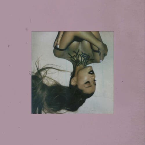
Style & Context
Influences
Helmut Newton provocation, Terry Richardson rawness, early 2000s teen magazine aesthetics
Location
The visual directly confronts 2018-2019's obsession with Grande's romantic life, reclaiming her narrative through controlled exposure.
Visual Language
The composition merges high-fashion boldness with intimate diary-entry vulnerability, creating tension between public performance and private confession.
Symbols
Inverted orientation
The upside-down perspective visualizes emotional disorientation during heartbreak and the perspective shifts required for healing.
Cascading hair
Her loose, flowing hair suggests letting go of control and embracing vulnerability as a path to freedom.
Pink border frame
The soft pink creates a safe container for pain, suggesting femininity reclaimed as strength rather than weakness.
Where Sound Meets Image
The disoriented perspective perfectly captures the album's exploration of spinning through grief, rebounds, and self-discovery. Songs like 'ghostin' and 'fake smile' examine emotional upheaval with brutal honesty, matching the cover's refusal to hide struggle behind polish. The minimalist approach mirrors the album's trap-pop production, where spacious beats create room for emotional nuance. The pink softness contradicts the album's sharp, sometimes petty lyrics, creating the same tension between sweetness and strength that defines tracks like the title song's gracious-yet-cutting thank-yous to exes.
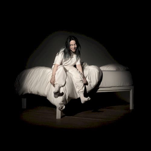
This cover helped normalize album art as emotional self-portraiture rather than aspirational fantasy, influencing countless pop releases that followed. The Polaroid-style border became ubiquitous in 2019-2020 pop visuals, from Billie Eilish to Olivia Rodrigo. Its success proved major pop stars could embrace vulnerability without sacrificing commercial appeal, paving the way for the confessional bedroom-pop aesthetic that dominated the early 2020s. The image circulated as mental health advocacy, with the inverted perspective becoming visual shorthand for seeing the world differently after trauma.