Style & Context
Influences
Solange Knowles' aesthetic direction, Malick Sidibé portraiture, Southern Gothic cinema, Vanity Fair celebrity portraiture
Location
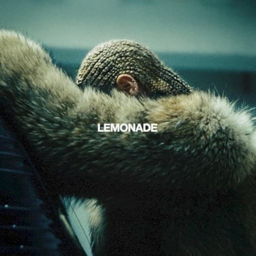
The cover signals high-art ambitions for pop music, arriving when Beyoncé positioned herself as visual auteur and cultural commentator.
Visual Language
The shallow focus and film grain texture create intimacy while the composition's negative space suggests isolation and contemplation.
Symbols
Luxurious fur coat
The extravagant pelts represent Black Southern prosperity while recalling her grandmother's mink coat inherited through generations.
Cornrow braids
The intricate protective style connects to African heritage and reclaims Black beauty standards within mainstream pop culture.
Tilted-back posture
Her head angles skyward in exhausted surrender, caught between prayer and the moment before drowning beneath betrayal.
Where Sound Meets Image
The cover's duality mirrors the album's navigation between fury and forgiveness across twelve chapters. Her closed eyes and reclined position suggest the introspective journey from 'Pray You Catch Me' through 'Formation,' moving through rage, grief, and ultimate self-possession. The stormy palette reflects the blues-rock guitars and trap bass that ground songs like 'Don't Hurt Yourself' and 'Sorry,' while the furs' softness hints at the vulnerability in 'Sandcastles.' This single image contains both the violence of bat-swinging destruction and the tenderness of reconciliation.
The cover redefined pop album art as fine art photography suitable for museum exhibition, leading to Lemonade's actual Smithsonian acquisition. Its rejection of literal lemonade imagery trusted audiences to understand metaphor, raising expectations for pop visuals. The aesthetic influenced everything from SZA's Ctrl to Solange's When I Get Home, establishing that Black women could center themselves in abstract, prestigious visual language rather than explicit narrative.