Style & Context
Influences
Indie album aesthetics, skateboard magazine photography, documentary realism
Location
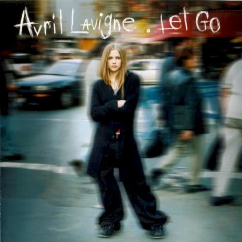
The urban setting codes maturity and edge without specifying whether it's Toronto, New York, or any anonymous Western city.
Visual Language
The cover borrows from alternative rock's authenticity codes while remaining polished enough for Top 40 radio display racks.
Symbols
Motion blur around static subject
The technique visualizes teenage alienation, where everyone else moves through life while the protagonist stands frozen in uncertainty.
Arms crossed defensive posture
This body language signals the guarded, don't-mess-with-me attitude that became her brand's foundation and mall-punk's universal gesture.
Oversized skater clothing
The baggy silhouette rejected Britney-era midriffs, coding Lavigne as the tomboy alternative for girls rejecting hyperfemininity.
Where Sound Meets Image
The motion blur mirrors the album's themes of feeling out of sync with expectations, particularly on the title track where letting go means standing still while everything changes. The urban anonymity reflects songs about small-town suffocation and teenage isolation. The sharp focus on Lavigne matches the album's clear, radio-ready production beneath its distorted guitars. The defensive posture visually represents the emotional walls described in 'I'm With You' and 'Unwanted,' where vulnerability hides behind attitude.
This cover established the visual template for pop-punk's mainstream invasion, proving that rebellion could be packaged without losing credibility with the target demographic. The motion blur technique became overused in teen marketing within two years. The image helped normalize tomboy presentation in pop, making space for artists who didn't fit the Maxim-ready mold. Clothing chains like Hot Topic built entire business models around the aesthetic this cover codified.