Style & Context
Influences
Futurism movement, Gerhard Richter paintings, rave culture flyer aesthetics
Location
The cover positioned Madonna within late-90s electronica culture while maintaining her pop accessibility and mainstream appeal.
Visual Language
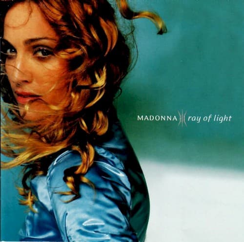
The technique literally embeds movement into a static image, paralleling how electronica embeds humanity into machines.
Symbols
Motion blur
The photographic distortion represents Madonna's transformation from material girl to introspective mother seeking meaning.
Streaming golden hair
Light itself becomes tangible, visualizing the album title's promise of illumination and transcendence.
Upward gaze
Her eyes look beyond the frame, suggesting spiritual seeking rather than confrontational sexuality.
Where Sound Meets Image
The motion blur perfectly captures the album's propulsive electronic beats and William Orbit's layered production. Tracks like the title song and Drowned World feature racing tempos that feel like forward momentum, which the streaking hair and distorted features visualize. The ethereal turquoise mirrors the ambient passages and trip-hop textures throughout. Madonna's spiritual lyrics about motherhood, mortality, and searching find their visual equivalent in her upward gaze and the light-filled palette, while the cobalt blue costume echoes the album's cool electronic atmospheres.
The cover established motion blur as shorthand for electronic music and spiritual transformation in pop visuals. It influenced countless early-2000s album covers that used photographic distortion to suggest depth and movement. The aesthetic directly inspired pop stars' reinvention narratives, showing that maturity could mean experimentation rather than retreat. Fashion photography adopted similar techniques to convey energy without literal action shots. The cover remains a template for how legacy artists can visually signal creative renewal.