Style & Context
Influences
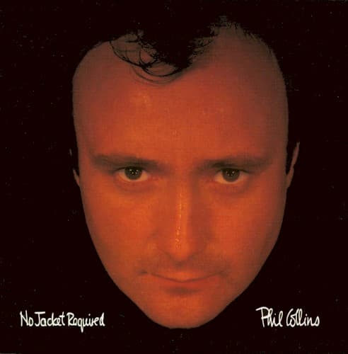
Robert Mapplethorpe portraiture, MTV-era visual boldness, theater headshots
Location
This direct-address style became standard for confessional eighties pop, influencing countless singer-songwriter covers that followed.
Visual Language
The extreme crop and controlled lighting create a portrait that's simultaneously casual and highly stylized for maximum visual impact.
Symbols
Disembodied floating head
The removed body emphasizes vulnerability and directness, stripping away the performer's physical persona to reveal raw emotion.
Direct eye contact
Collins stares straight into the camera, creating confrontational intimacy that mirrors the album's personal storytelling about divorce and loneliness.
Absolute black void
The featureless background isolates the artist completely, reflecting the emotional isolation threading through songs like 'One More Night.'
Where Sound Meets Image
The cover's uncomfortable intimacy mirrors the album's lyrical vulnerability, particularly the divorce-themed ballads that dominated side one. While the music embraced state-of-the-art drum machines and synthesizers, this analog human face anchored the high-tech production in raw emotion. The warmth of the lighting parallels the album's blue-eyed soul influences and polished production, while the isolation of the image reflects the loneliness in tracks like 'Don't Lose My Number' and 'Take Me Home.'
This cover helped establish the floating-head-on-black template that dominated adult contemporary and pop packaging through the nineties. Its rejection of elaborate styling in favor of pure facial recognition influenced how established artists presented themselves—less as characters or fantasies, more as known personalities. The design's confidence in Collins' recognizability also marked a shift toward celebrity-driven marketing in pop music.