Style & Context
Influences
Cosmic funk album art, New Wave DIY aesthetics, glam rock lettering, psychedelic poster design
Location
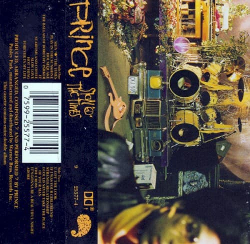
The cassette-focused marketing reveals how Prince understood his young, Black, and racially diverse audience consumed music portably.
Visual Language
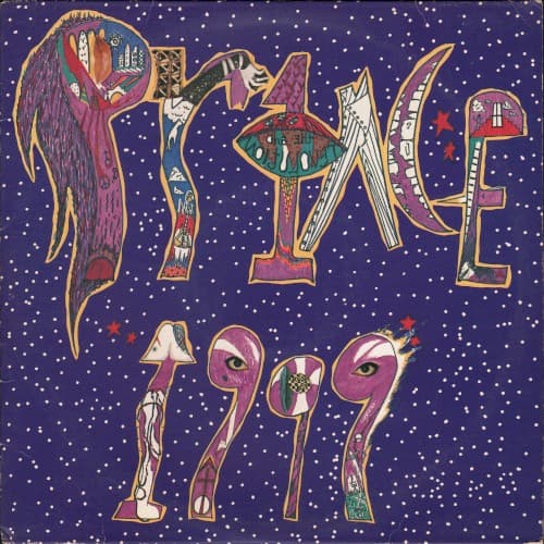
The deliberately imperfect hand-drawn style rejects the slick airbrush realism dominating early-80s R&B covers.
Symbols
Hand-drawn lettering
The childlike, imperfect letterforms reject corporate polish in favor of intimate, personal expression.
Starfield backdrop
The cosmos positioning frames 1999 as both a date and a destination beyond earthly concerns.
Cane figure in first letter
The walking stick silhouette previews Prince's dandy persona that would dominate his visual identity.
Where Sound Meets Image
The hand-drawn cosmic aesthetic perfectly mirrors the album's fusion of synthetic and organic sounds. The purple starfield evokes the album's apocalyptic themes—'1999' imagines partying through nuclear war—while the playful, colorful lettering matches the album's celebration of hedonism and liberation. The mix of sophistication and childlike wonder in the design reflects Prince's lyrical balance between sexual maturity and Peter Pan-like refusal to grow up. The cosmic setting amplifies tracks like 'Let's Pretend We're Married' and 'Little Red Corvette' as transmissions from another dimension.
This cover established purple as Prince's signature color two years before Purple Rain made it official pop culture shorthand for his entire universe. The hand-drawn aesthetic influenced countless R&B and hip-hop artists who rejected photographic realism for illustration and cartoon aesthetics. The cosmic party vibe directly inspired OutKast's ATLiens and Janelle Monáe's Afrofuturist visual language. Even the cassette-focused marketing presaged how Prince would later experiment with distribution formats and reject industry standards.