Style & Context
Influences
Urban photography, concert documentation, Minneapolis club culture
Location
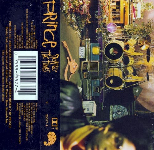
The cluttered stage aesthetic reflects Minneapolis as a scrappy alternative to coastal music scenes.
Visual Language
The grainy, atmospheric quality mirrors the album's themes of social decay and personal reflection.
Symbols
Bar Grill signage
The makeshift urban signage represents the working-class Minneapolis club scene that shaped Prince's musical identity.
Drum kit and stage setup
The visible instruments emphasize live performance over studio polish, signaling a return to raw musicianship.
Potted plants on stage
Domesticity invading the performance space suggests blurring boundaries between public persona and private creativity.
Where Sound Meets Image
The cluttered, multi-layered stage mirrors the album's dense musical arrangements spanning funk, rock, soul, and gospel. Just as the cover shows various elements competing for attention, the double album tackles AIDS, poverty, gang violence, and spiritual yearning across 16 tracks. The visible drum kit connects to the sparse, drum-machine-driven title track, while the warm lighting suggests the sensuality of songs like 'Adore' and 'Slow Love.' The DIY aesthetic reflects Prince's decision to record most instruments himself after disbanding The Revolution.
This cover influenced subsequent artists to embrace lo-fi aesthetics and reject overproduced glamour shots. The documentary approach anticipated how hip-hop would use raw street photography in the 1990s. Its refusal to feature Prince's face on the front cover was radical for a major pop star, prioritizing artistic statement over celebrity branding and paving the way for more conceptual album packaging.