Style & Context
Influences
Andy Warhol screen prints, 1970s snapshot albums, fashion editorial minimalism
Location
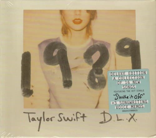
This cover rejected the hair-blowing glamour shots flooding iTunes in 2014 for documentary-style simplicity instead.
Visual Language
The instant film grain and chemical color shifts mimic personal photo albums from Swift's actual birth era.
Symbols
Cropped face
Swift removes her recognizable features to let the music define her new identity completely.
1989 handwritten digits
The birth year becomes both personal timestamp and declaration of generational pop ownership.
Seagull shirt graphic
Birds represent the freedom Swift claimed by leaving country music's constraints behind permanently.
Where Sound Meets Image
The faded Polaroid warmth mirrors the album's synth-pop nostalgia for 1980s production while maintaining modern clarity. Cropping Swift's eyes reflects songs like Blank Space and Style that examine her public persona from detached angles. The handwritten numbers echo the album's confessional diary-entry lyrics about New York romance and media scrutiny. The soft focus matches the dream-pop textures layered throughout tracks like Wildest Dreams and This Love.
This cover popularized lo-fi photography aesthetics across pop music packaging when high-gloss retouching dominated the industry. The Polaroid format influenced countless artists who adopted vintage instant film for authenticity signaling. Swift proved major pop stars could use anti-glamour imagery and still achieve record-breaking sales. The faceless composition became a blueprint for artists signaling reinvention through visual restraint rather than spectacle.