Style & Context
Influences
Richard Avedon, Anton Corbijn, German Expressionist cinema, art film portraiture
Location
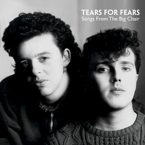
This cover emerged from Bath, England, reflecting British new wave's tendency toward introspection over American pop's optimism.
Visual Language
The severe lighting and tight composition borrow from fashion photography while rejecting pop's typical glamour.
Symbols
Direct eye contact
Both members stare unflinchingly at the viewer, demanding engagement rather than passive consumption.
Close facial framing
The tight crop eliminates context and background, forcing focus on emotional vulnerability and psychological presence.
Orzabal's earring
A small rebellion against conservative British masculinity, signaling the duo's willingness to challenge social norms.
Where Sound Meets Image
The stark portrait mirrors the album's exploration of childhood trauma, therapy, and psychological excavation across songs like 'Shout' and 'The Working Hour.' While the music features lush synthesizers and expensive production, the cover suggests the personal darkness underneath the sheen. The direct gazes reflect lyrics about confronting inner demons rather than escaping them. Even 'Everybody Wants to Rule the World,' the album's poppiest moment, carries undertones of power anxiety that this serious portrait reinforces.
This cover helped establish a template for intelligent pop acts wanting to distance themselves from teen magazine fodder. The monochrome portrait approach influenced countless 90s alternative bands seeking credibility, from Radiohead to The Verve. Fashion photography absorbed the lesson that minimalism could convey depth, while later synth-pop revivalists like The xx and Chvrches returned to this aesthetic when they wanted to signal substance over style.