Style & Context
Influences
Richard Avedon, Annie Leibovitz, classic Hollywood portraiture, 1960s fashion photography
Location
The minimalist approach stood apart from the maximalist visuals dominating pop in 2015's EDM-influenced era.
Visual Language
The technique borrows from fashion editorial while rejecting its typical glamour for something more personal.
Symbols
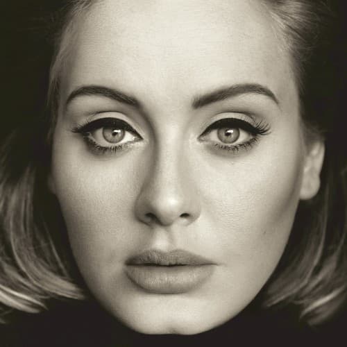
Direct eye contact
Her gaze meets the viewer without hesitation, establishing emotional connection before a note plays.
Absence of jewelry or styling
The lack of adornment signals artistic stripping-back, prioritizing raw emotion over pop spectacle.
Soft focus around edges
The vignette effect draws all attention to her eyes, mirroring the album's introspective focus.
Where Sound Meets Image
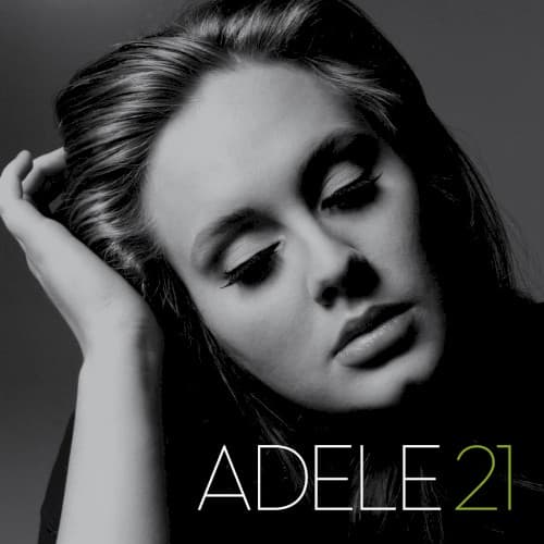
The stark visual perfectly captures the album's themes of reflection and confronting the passage of time. Songs like 'Hello' and 'When We Were Young' deal with looking back and processing regret, and the unblinking portrait embodies that same unflinching self-examination. The monochrome treatment mirrors the piano-driven production that dominates the album—classic, unadorned, emotionally direct. Where her previous album '21' featured a more distant, contemplative pose, this close-up suggests the increased intimacy of her songwriting at 25.
The cover helped reestablish minimalist portraiture as viable in an increasingly crowded visual landscape. Its success proved that even in the streaming era, a simple face could command attention and communicate artistic seriousness. The image became endlessly memed and parodied, cementing its place in pop visual culture despite—or because of—its simplicity.