Style & Context
Influences
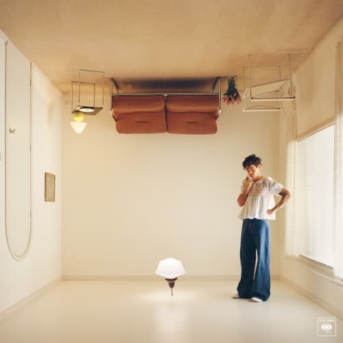
1970s rock album covers, David Hockney pool paintings, Magritte surrealism
Location
The cover's soft aesthetics aligned with the rise of gender-fluid fashion and the normalization of male emotional expression.
Visual Language
The clean lines and surreal spatial relationships create disorientation while maintaining pop accessibility and charm.
Symbols
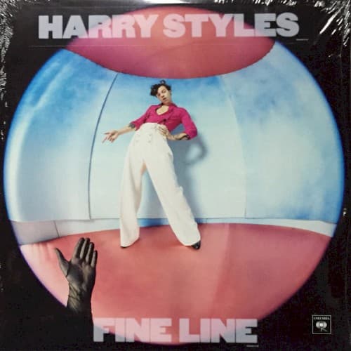
Fishbowl enclosure
The curved glass walls represent being observed under public scrutiny while navigating private emotions.
Reaching hand from below
The disembodied hand symbolizes connection attempts and the album's themes of longing and separation.
Wide-legged stance, elevated position
His confident posture suggests emotional elevation and finding balance after turbulent relationship experiences.
Where Sound Meets Image
The cover's suspended, floating quality mirrors the album's production style, which layers dreamy guitars and synths to create weightless soundscapes. The reaching hand from below connects to songs like 'Falling' and 'Cherry,' which grapple with lost connections and the desire to hold onto relationships slipping away. The gradient environment reflects the album's emotional arc from heartbreak's blue melancholy to the pink-tinted hope of healing and self-discovery across its runtime.
The cover helped cement pastel aesthetics in mainstream pop marketing and demonstrated how male pop stars could use surrealism and soft visuals without compromising commercial appeal. Its fishbowl concept has been referenced in subsequent music videos and tour visuals, becoming shorthand for celebrity containment. The design influenced a wave of gradient-heavy album covers in pop and indie circles from 2020 onward.