Style & Context
Influences
Fashion editorial photography, punk album aesthetics, product branding, Andy Warhol portraiture
Location
This arrived when Jackson faced tabloid scrutiny about his appearance, relationships, and perceived softness following Thriller's global domination.
Visual Language
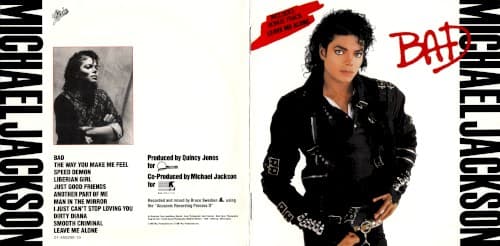
The cover merges high-fashion photography with punk rebellion, positioning Jackson as both luxury commodity and street rebel.
Symbols
Buckled black leather jacket
The military-style hardware transforms Jackson from entertainer into warrior, armor against critics questioning his masculinity and toughness.
Red feather and lipstick logo
Feminine touches deliberately court controversy, merging androgyny with aggression in ways that challenged 1987's rigid gender expectations.
Side profile photograph insert
The softer, contemplative portrait offers duality, suggesting the hardened exterior protects a more introspective artist beneath the costume.
Where Sound Meets Image
The cover's monochrome severity matches Bad's grittier production—harder drums, rock guitars on the title track, and lyrics about street credibility. Where Thriller's cover showed Jackson in gentlemanly white, Bad's black leather announces songs like 'Dirty Diana' and 'Smooth Criminal' exploring darker themes of desire and danger. The stripped-down design mirrors Quincy Jones and Jackson's decision to create a more focused, aggressive sound after Thriller's genre-hopping sprawl. Even the typography—sharp, confrontational—echoes the album's direct, declarative songwriting.
This cover established the template for pop reinvention through radical visual transformation, influencing artists from Justin Timberlake's FutureSex/LoveSounds makeover to The Weeknd's shifting personas. The use of stark contrasts and minimal elements against white backgrounds became standard for albums announcing artistic maturity. Fashion photography's dominance in music packaging traces partly to this cover's success in merging haute couture with pop accessibility, making the leather jacket as culturally significant as Thriller's red one.