Style & Context
Influences
Patrick Demarchelier glamour shots, early 2000s fashion editorials, MySpace profile aesthetics
Location
This cover arrived when pop stars like Britney and Christina had already walked the virgin-to-vixen path publicly.
Visual Language
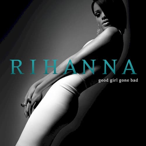
The clinical studio lighting and retouching create a magazine-cover perfection that distances Rihanna from organic R&B roots.
Symbols
Partial body framing
The cropped composition objectifies while empowering, reclaiming the male gaze for her own narrative control.
Looking away from camera
The averted gaze suggests mystery and emotional distance, reinforcing the album's themes of detachment and betrayal.
Turquoise typography
The digital-native color choice positions Rihanna as a product of the internet age's synthetic sensuality.
Where Sound Meets Image
The clinical black and white palette mirrors the album's cold electronic production on tracks like 'Don't Stop the Music' and 'Shut Up and Drive,' where synthetic beats replaced organic instrumentation. The confident pose reflects the defiant swagger of 'Breakin' Dishes' and the title track's declaration of reinvention after heartbreak. The turquoise accent color connects to the album's club-ready electropop moments, those strobing dance floor anthems that dominated 2007's pop landscape. The entire composition embodies the album's central thesis: a Caribbean artist shedding genre expectations to become a global pop chameleon.
This cover established the template for Rihanna's subsequent visual identity: provocative minimalism with strategic color pops that became her signature across eight albums. The bold typography and reductive imagery influenced how pop stars marketed reinvention in the social media age, prioritizing immediate visual impact over narrative complexity. Subsequent artists from Beyoncé to Dua Lipa adopted similar monochrome-plus-accent aesthetics for their own transformation albums.